Email Sign-Up Tools to Help You Grow Your List and Your Business
- Subscribe to RSS Feed
- Mark as New
- Mark as Read
- Bookmark
- Subscribe
- Printer Friendly Page
- Report Inappropriate Content
The best way to grow your business is to start by building your email list and. And you do that by using email sign-up tools that provide quick and easy ways for new subscribers to sign up.
The problem is that not all of your potential subscribers use the same methods to interact with your business — some might visit your website, others might follow you on social media, and there are those who prefer the face-to-face interaction they get when they visit your business.
Fortunately, there are great email sign-up tools you can use in all of these situations to allow people to subscribe, and they are all available through your Constant Contact account.
5 email sign-up tools to help you build and grow your email list
Let’s start by navigating to where you can find the various types of online sign-up forms you can create within your Constant Contact account.
Once you’ve signed into your account, click the “Sign-up Forms” link in the top menu of your account. Then, click on the blue “Create sign-up form” button in the upper right-hand corner of the page. After that, you can choose what kind of sign-up form you’d like to create.
It’s that easy.
Now, let’s take a look at our options.
1. Website sign-up forms
At the top of the email sign-up tools are the website sign-up forms.
There are four options for your website sign-up forms:
- Pop-up
- Flyout
- Banner
- Inline
The pop-up sign-up form
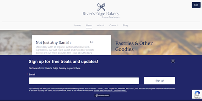
Just like it sounds, this sign-up form will “pop up” on the screen when someone visits your site. But when that form pops up, on what devices it pops up — mobile or desktop — and even if the Constant Contact branding is shown is all up to you.
Flyout sign-up forms
If you choose the animation option, this type of sign-up form slides onto the screen and then slides back off. While it covers part of the screen it tends to be less alarming or intrusive than a pop-up form may seem, and you can choose where on your page the form appears — letting you decide what gets covered by the form and what doesn’t.
The banner
The banner sign-up form shows up on your visitor’s screen as a broad block either at the top or the bottom of the screen.

As with the previously mentioned sign-up forms, you can set the banner sign-up form to show up on your visitor’s screen one exit intent, or on a timer. You can also choose how often a visitor will see the sign-up form — from several times a visit to only once in a lifetime (or until they clear their browser’s cookies — whichever comes first).
No matter which form you choose, the content setup is the same and customizing the look and feel of the form is quick and easy.
In-line sign-up forms
An in-line sign-up form is a static form that is embedded on a web page. In other words, it ‘sits’ on the page, waiting for someone to find it and fill it out.
These forms are often found on “contact us” pages and can be updated in your Constant Contact account without having to edit your website every time you want to make a change to your form. However, installing an in-line sign-up form does require that your website builder or hosting platform must support Javascript and you’ll have to use HTML code, so if you’re not comfortable doing so, I suggest you have your webmaster install it for you.
2. SMS/Text message (Text-to-Join)
The next sign-up tool — “Text-to-Join” — allows your customers to join both your email and SMS lists at the same time. Allowing you to reach your audience where they are the most.
In Constant Contact, using Text-to-Join is super easy. All you have to do is choose an email segment to add your Text-to-Join signups to and activate the tool. Constant Contact will automatically send out a welcome SMS as well as auto-responses for both “yes” and “no” replies.
After that, all you have to do is share your Text-to-Join number with your prospects, inviting them to join your list.
Of course, as with all marketing tools, you’ll want to use SMS marketing best practices when reaching out to your audience via text.
3. QR code (Scan-to-Join)
Often overlooked, this tool gives visitors a second way to join your email lists with their smartphones. And, if you implemented tool number two, you’ve done most of the work already.
In the past, QR codes were pretty basic and didn’t always stand out, but now there are a multitude of options so you can create the right QR code for your printed material.
Standard QR code
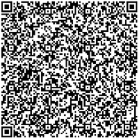
The standard black and white QR codes are the simplest and most easily recognized of QR-code styles. These stand out the most when everything around them is full of color and movement.
 When creating a QR code, remember that the longer the URL, the larger and more complex the code will be. Scan this one to download our email list growth checklist.
To create one of these codes, after you’ve created your Lead Generation Landing Page, copy the URL and paste it into a third-party tool like:
The framed QR code
Using a framed QR code adds a call to action (CTA) to the code, letting viewers know exactly what they should do.
 Scan to subscribe to the Hints & Tips newsletter.
To create one of these codes, use a third-party tool like qr-code-generator.com powered by bitly. It’s free to create, but bitly may charge a fee to keep it active beyond the trial period, so before you add this to your print ads, make sure you’ve either paid for a subscription or only plan to use the code for things like limited-time offers and sales.
Customized QR code
If you plan to use simple black text on a pale background for your flyer, then I recommend adding a little flair to your code.
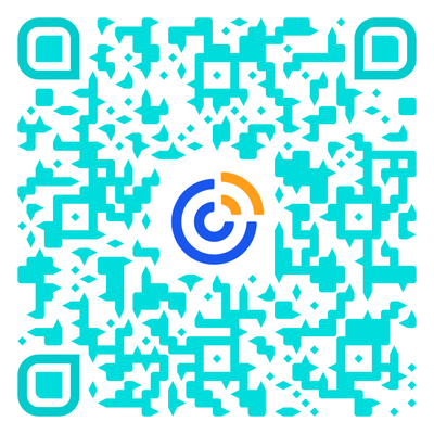
 Scan this custom QR code to learn more about our list-building tools.
When it comes to creating a customized QR Code, you can change everything from overall color to adding your logo or custom artwork and even changing the eye shape, as I did with the image above.
To create one of these codes, after you’ve created your Lead Generation Landing Page, copy the URL and paste it into a third-party tool like:
- QRstuff
- Delvir
- QRCode Monkey (this one has the most options that I’ve found in a code creator)
After you’ve created your lead-generation landing page, create your QR code and download or copy the image and paste it into any form of print media you’d like. We suggest putting it in all of your print media, from business cards to fliers — even on your printed sign-up form to give people the option to either write or type their information into your sign-up form. Also feel free to check our guide on top ways to generate leads.
4. Printed sign-up form
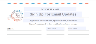
This tool is a tried and true method for getting people to sign up for your email list when at your register or trade show booth.

A simple paper sign-up form can go a long way when chatting with people in person. To get started, simply download our free Offline List Growth .pdf, choose one of the eight list options, and customize it. Then print as many copies as you like.
Start collecting email addresses
Now that you know how to create these great email sign-up tools, make sure you’re asking people to join your email list. Tell your customers or members about your email newsletter on your website, your Facebook Page, and at your business.
Now that you’ve started building your list, it’s time to learn how to segment your email list so you can work smarter instead of harder.
You must be a registered user to add a comment. If you've already registered, sign in. Otherwise, register and sign in.
Resources
Community Blog
Check out marketing advice, tips, and tricks. All from our Constant Contact experts
Visit the blog-

Featured Article
Why Picking the Right Fonts for Your Emails Matters
When it comes to email marketing, design plays a huge role in grabbing attention and keeping your readers engaged.
See Article -

Featured Thread
The Unintentional Humor of Spam Emails
Have you ever wondered who or what is on the other side of a spam email? Take 10 minutes out of your day and watch this lighthearted video!
View thread -

Featured Thread
How to Create Images of Multi-Page PDFs
Discover the process of transforming PDFs with multiple pages into image files directly on Constant Contact.
See Article


