Aligning an image vertically in a featured article block

SOLVED
Go to solution
HopeandCope
Marketing Legend
0 Votes

HI, Is there a way to have an image align vertically in a featured article block. It doesn't look very good when the image is at the top of the row and there is a lot of whitespace below it, and almost none above it. Thanks, L

1 ACCEPTED SOLUTION
William_A
Administrator
0 Votes

Hello @HopeandCope ,


Generally speaking, Featured Articles are to include an image, a very short summary of a webpage or caption, and then a link to a larger article. If you add too much text, you start to end up with this kind of setup:
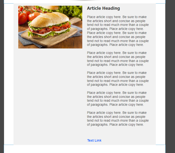
Capture1.PNG


If you're wanting to have a longer description for your article setup, and adjusting the column border between the two doesn't achieve a more desirable visual, then here's a couple suggestions for how you can better format the setup.


First suggestion:

You could have just one or two paragraphs on the side. Then place a separate article block beneath, with the image removed so you still have that inner color difference. Then just add the rest of your text.
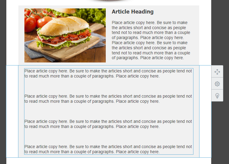
 

Capture2.PNG


Second suggestion:

You could text-wrap your image into the body of text instead.
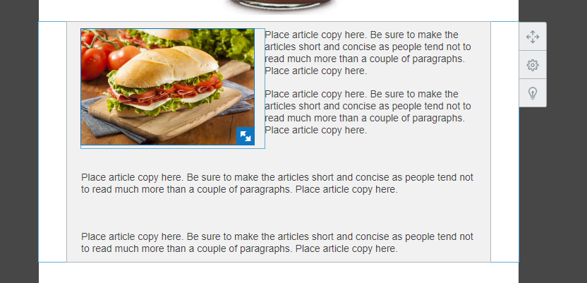
 

Capture3.PNG


~~~~~~~~~~~~~~~~~~~~~~~~~~~~~~~~~~~
William A
Community & Social Media Support

View solution in original post

2 REPLIES 2
William_A
Administrator
0 Votes

Hello @HopeandCope ,


Generally speaking, Featured Articles are to include an image, a very short summary of a webpage or caption, and then a link to a larger article. If you add too much text, you start to end up with this kind of setup:

Capture1.PNG


If you're wanting to have a longer description for your article setup, and adjusting the column border between the two doesn't achieve a more desirable visual, then here's a couple suggestions for how you can better format the setup.


First suggestion:

You could have just one or two paragraphs on the side. Then place a separate article block beneath, with the image removed so you still have that inner color difference. Then just add the rest of your text.


Capture2.PNG


Second suggestion:

You could text-wrap your image into the body of text instead.


Capture3.PNG


~~~~~~~~~~~~~~~~~~~~~~~~~~~~~~~~~~~
William A
Community & Social Media Support
HopeandCope
Marketing Legend
0 Votes

Thanks for the suggestions. Let me see which works best. I don't have this situation every week, and often, the amount of text is not as large as the example you provide, but is enough to make it visually less appealing.


Thanks,


L

  • Avatar

    Featured Article

    Use Sections to Build Email Campaigns Faster and Improve Engagement Rates

    Using Sections while designing your marketing email not only increases your own efficiency but helps you to deliver a more friendly, organized message. Check out some of the key benefits of using sections in email.

    See Article
  • Avatar

    Featured Thread

    Casual Conversations: What's your go-to playlist?

    If you listen to music while you work, share your playlist below so we can be inspired and maybe find some new music!

    View thread
  • Avatar

    Featured Thread

    Ready, Set, Send Reflections

    The Ready, Set, Send Challenge has finished! Let's reflect on the wins and accomplishments over the last six weeks.

    Join challenge
Updates
Just Getting Started?

We’re here to help you grow. With how-to tutorials, courses, getting-started guides, videos and step-by-step instructions to start and succeed with Constant Contact.

Start Here

73% of SMBs express doubt that their marketing strategy is effective. Does this sound familiar? Read our Small Business Now Report to learn how you can tweak your strategy to see better results.

Go read our article
Upcoming Webinars
NOV 14
Tis' the Season for Last-Minute Holiday Marketing
2PM - 3PM EST