- Mark as New
- Bookmark
- Subscribe
- Mute
- Subscribe to RSS Feed
- Permalink
- Report Inappropriate Content
The Template Runway Sweepstakes ended awhile ago, but during that time a few of us Community moderators wanted to reflect on some of the email campaigns that were submitted and share our thoughts about them. Email Templates
It was hard to narrow it down to just these twelve campaigns and it is certainly not exhaustive as we received a lot of great entries. Being featured on this list is not a reflection of winning the sweepstakes (the winners were chosen at random).
We are hoping to do more template showcases in 2023, so consider this a test run for future endeavors. The images below are just a snapshot of the full campaigns, please click on the images to view their full glory.
|
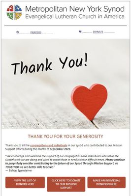
Consensus: Bright, inviting imagery coupled with clear call-to-actions and organized content helps this template shine. |
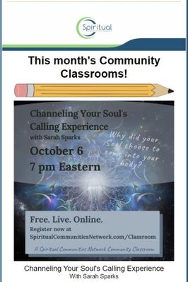
Consensus: The notepad template with the pencil dividers is a fun and unique look to organize the template and the social sharing options make it easy for the audience to share it with their friends. |
|
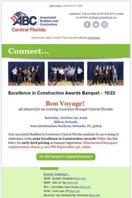
Consensus: Contact information at the top is a nice touch, plus the callout to see last week's email if you missed it. The different banners make each section feel like a mission statement. |
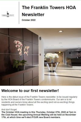
Consensus: Simple and clean. Short and sweet. Crisp, professional image to draw you in.
|
|
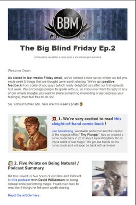
Consensus: The use of featured article blocks to break up the content and creating an alternating text-to-image format has a nice feel. The email isn't very long and gives you opportunity to read further elsewhere. |
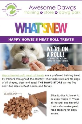
Consensus: It's dogs, what's not to love?! The email is short, effective, and also uses video for additional content.
|
|
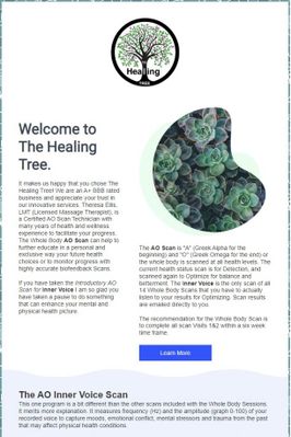
Consensus: The template has a clean aesthetic and the oblong image is unusual, but works really well. |
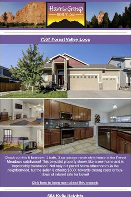
Consensus: The email only focuses on a couple of property listings, as to not overwhelm. The images are the primary focus of the email and we like the tease with "Soon to be listed." |
|
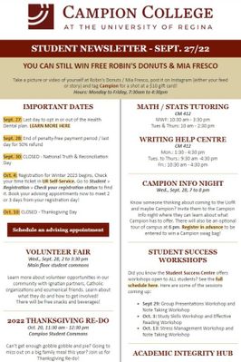
Consensus: A clean newsletter-style template that utilizes multiple columns well. A touch of humor as well with the use of memes, but all the important information is still there. |
Consensus: Utilizes the logo colors to brand the rest of the template. The images give it a personal touch. It is a long email, but organized well. |
|
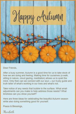
Consensus: Warm, pleasant colors and design. Short and sweet content.
|
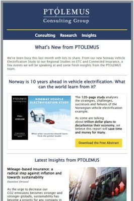
Consensus: Professional and organized. The colors are simple, but work. The featured articles give the reader a chance to dig deeper outside of the email. |
Content Manager Elevate your marketing with Constant Contact's Professional Design Services! From eye-catching email templates to custom branding and social media graphics, our professional design services are tailored to boost your business's impact and engagement. |  |
|---|

