- Constant Contact Community
- >
- Support Forum
- >
- Questions & Discussions
- >
- Re: Images are left aligned on desktop but become ...
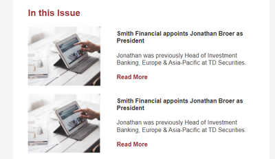
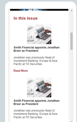
Images are left aligned on desktop but become centered aligned on mobile ruining the layout.
SOLVED- Subscribe to RSS Feed
- Mark Topic as New
- Mark Topic as Read
- Float this Topic for Current User
- Bookmark
- Subscribe
- Mute
- Printer Friendly Page
- Mark as New
- Bookmark
- Subscribe
- Mute
- Subscribe to RSS Feed
- Permalink
- Report Inappropriate Content
Using text wrap around an image and the article widget, all my images become centered aligned while the text stays left aligned. How can I prevent this or build it out in a way so this wont happen?
Solved! Go to Solution.
- Labels:
-
E-Mail Marketing
- Mark as New
- Bookmark
- Subscribe
- Mute
- Subscribe to RSS Feed
- Permalink
- Report Inappropriate Content
Hello @ElizabethNordgren ,
Email mobile apps will always try to display images centered and as large as they can based on the screen width and images' metadata sizing. This will occur whether the image is in a column to the side, or text-wrapped. I'd recommend checking out the follow articles regarding mobile displays, and optimizing emails for them:
- Best practices for mobile-friendly emails
- Overwriting image sizes for optimal desktop and mobile viewing
~~~~~~~~~~~~~~~~~~~~~~~~~~~~~~~~~~~
William A
Community & Social Media Support
- Mark as New
- Bookmark
- Subscribe
- Mute
- Subscribe to RSS Feed
- Permalink
- Report Inappropriate Content
- Mark as New
- Bookmark
- Subscribe
- Mute
- Subscribe to RSS Feed
- Permalink
- Report Inappropriate Content
Hello @ElizabethNordgren ,
Email mobile apps will always try to display images centered and as large as they can based on the screen width and images' metadata sizing. This will occur whether the image is in a column to the side, or text-wrapped. I'd recommend checking out the follow articles regarding mobile displays, and optimizing emails for them:
- Best practices for mobile-friendly emails
- Overwriting image sizes for optimal desktop and mobile viewing
~~~~~~~~~~~~~~~~~~~~~~~~~~~~~~~~~~~
William A
Community & Social Media Support
- Mark as New
- Bookmark
- Subscribe
- Mute
- Subscribe to RSS Feed
- Permalink
- Report Inappropriate Content
So in short theres no way to align an image left on mobile in Constant Contact?
We are limited to building stacked blocks in one or two or three columns in order to maintain proper responsiveness?
- Mark as New
- Bookmark
- Subscribe
- Mute
- Subscribe to RSS Feed
- Permalink
- Report Inappropriate Content
Correct
~~~~~~~~~~~~~~~~~~~~~~~~~~~~~~~~~~~
William A
Community & Social Media Support
-

Featured Article
The Power of Direct Subscriber Feedback: Measuring Customer Satisfaction
Today, understanding customer satisfaction is crucial. How can you know if customers are happy with your products or services?
See Article -

Featured Thread
The Unintentional Humor of Spam Emails
Have you ever wondered who or what is on the other side of a spam email? Take 10 minutes out of your day and watch this lighthearted video!
View thread -

Featured Thread
How to Create Images of Multi-Page PDFs
Discover the process of transforming PDFs with multiple pages into image files directly on Constant Contact.
See Article
Just Getting Started?
We’re here to help you grow. With how-to tutorials, courses, getting-started guides, videos and step-by-step instructions to start and succeed with Constant Contact.
Start Here


