Hello -
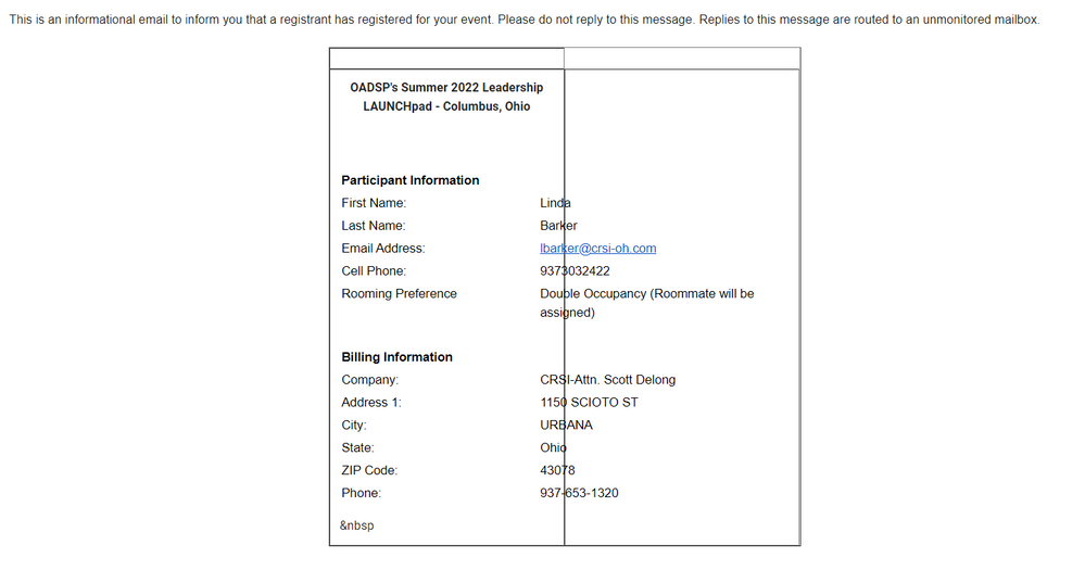
I've been working with CC for a while now, and I'm consistently underwhelmed by the format and styling of the "informational email" I receive when someone registers for my events. I've attached a screenshot of one such email I received today. The table's formatting, the offset placement of the header, the size of the font, the random (HTML?) characters in the lower left - these are all problematic. Is there a way for me/the end user to create more easily-read notification emails to replace the poor job below?
Thank you -
Emily
Solved! Go to Solution.
Hello @OADSP ,
At this time there is no control over the formatting of this automated notification email. Our devs are working on a newer event system, however at this time we do not have an ETA on the release of this newer tool.
Hello @OADSP ,
At this time there is no control over the formatting of this automated notification email. Our devs are working on a newer event system, however at this time we do not have an ETA on the release of this newer tool.
We’re here to help you grow. With how-to tutorials, courses, getting-started guides, videos and step-by-step instructions to start and succeed with Constant Contact.
Start HereFeatured Article
Using Sections while designing your marketing email not only increases your own efficiency but helps you to deliver a more friendly, organized message. Check out some of the key benefits of using sections in email.
See ArticleFeatured Thread
If you listen to music while you work, share your playlist below so we can be inspired and maybe find some new music!
View threadFeatured Article
Check out all the great articles, discussions, and events for the month of August!
See Article