You don't need to be a web design expert to create an effective landing page that will help grow your email list. We’ve got tips and tricks to help you design a landing page that converts.
 Click to view and download guideWhat is a landing page?
First things first, let's talk about what a landing page is – it’s a standalone web page that you create for a marketing or advertising campaign where someone "lands" after clicking an ad, a button, or a link in a social media post.
Why do I need a landing page?
A good landing page helps build your email list, direct traffic, engage prospects, and drive conversions. Plus, you can track metrics and measure results. Landing pages are simple and highlight one call to action (CTA), such as signing up for your email newsletter. The conversion rate for landing pages is a whopping 160% higher than the next best sign-up tool.
Make sure to download our First Impressions Matter: How to Create Landing Pages that Make Your Audience Take Action guide for additional pointers, resources, and examples!
How do I set up a landing page?
You can use Constant Contact to build lead generation landing pages that will grow your subscriber list. Let's break it down into a few fundamentals and best practices to follow while you are designing your landing page:
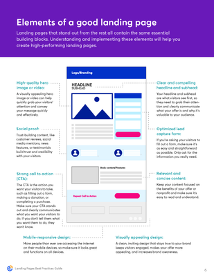
- Explain what you offer. Focus on one service or product per landing page to make your message clear and easy to understand.
- Only ask for what you really need in the sign-up form – keep it short.
- Keep your messaging focused and highlight the key benefits to tell your audience why they should sign up. You can do this by using a unique selling proposition (USP), which is a statement that demonstrates why your product or service is the best.
- Make sure your information is scannable. Use headings, short chunks of text, and colors that make your message easy to read.
- Organize your sections in a logical order to guide the viewer’s eye across your page. Additionally, remember that visitors might experience your landing page on a mobile device. Consider how it will look on different devices and make sure the page is mobile responsive.
- Maintain your brand identity by using colors, fonts, logos, and other elements that match other marketing materials. Be sure to use engaging images and videos that are relevant to your business instead of stock imagery.
- Highlight customer reviews, ratings, awards, or statistics. The key is to build confidence in your brand and what you're offering.
- Optimize your landing page the same way you would for other web pages.
 Click to enlargeHow do I get people to my landing page?
There are many ways to get traffic to your landing page! Try using various channels like your website, social media, paid ads, and more:
- Promote your landing page on your website or in popups.
- Share the link to your landing page on social media platforms.
- Add a QR code to your print and packaging materials.
- Send out SMS text messages to get people interested.
- Offer an incentive – for example, an exclusive discount – in exchange for visitor information.
Related: Grow Your List Online: Signup Forms
Our hope with these tips and tricks is that you can easily design a compelling landing page that captivates your audience and drives them to take action. Join the conversation and share your thoughts on managing contacts and growing your lists!
