- Mark as New
- Bookmark
- Subscribe
- Mute
- Subscribe to RSS Feed
- Permalink
- Report Inappropriate Content
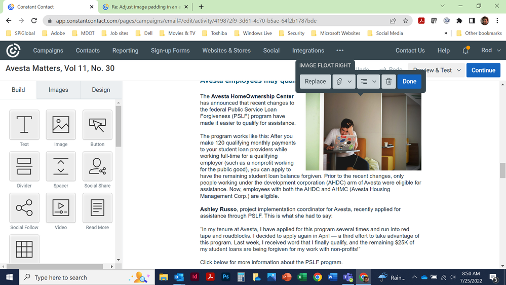
Suddenly, there is no longer the option to click on an image to ad padding. As a result, there is no space between the image and the text jn the mobile version of the campaign, and it looks sloppy and amateurish. Is anyone else having this issue? It's almost as if they are trying to drive customers away with each update.
- Labels:
-
E-Mail Marketing
-
Library
- Mark as New
- Bookmark
- Subscribe
- Mute
- Subscribe to RSS Feed
- Permalink
- Report Inappropriate Content
Hi @Solson ,
There is still a way to adjust the padding regardless of which editor you are using. Please see this guide for a walkthrough on adjusting the image padding. Similarly, you can add a spacer block above or below the image, and adjust the padding pixel by pixel.
Amanda G.
Community & Social Care
Did I answer your question? If so, please mark my post as an "Accepted Solution" by clicking the Accept as Solution button in the bottom right hand corner of this post.
You're not alone on your email marketing journey. Connect with a Marketing Advisor to see how they can help you develop the right strategy for your business and get the most out of your Constant Contact experience.
- Mark as New
- Bookmark
- Subscribe
- Mute
- Subscribe to RSS Feed
- Permalink
- Report Inappropriate Content
Neither option is available when the text wraps around the image:
- Mark as New
- Bookmark
- Subscribe
- Mute
- Subscribe to RSS Feed
- Permalink
- Report Inappropriate Content
Text wrapping doesn't have adjustable padding, as the default is there to ensure no bleedthrough from text. If you're wanting to adjust padding, I'd advise adding your image outside of the text block - i.e. drag and drop when it's a pink line, not a pink box.
~~~~~~~~~~~~~~~~~~~~~~~~~~~~~~~~~~~
William A
Community & Social Media Support
- Mark as New
- Bookmark
- Subscribe
- Mute
- Subscribe to RSS Feed
- Permalink
- Report Inappropriate Content
There used to be padding around a photo with text wrap. Now there isn't. Why did you remove that functionality?
- Mark as New
- Bookmark
- Subscribe
- Mute
- Subscribe to RSS Feed
- Permalink
- Report Inappropriate Content
That functionality may have been a part of the more HTML-intensive 2ge builder, but that's been retired for some time now. The retiring 3ge builder and the current CPE builder don't have a padding adjustment aspect to text-wrapped images.
~~~~~~~~~~~~~~~~~~~~~~~~~~~~~~~~~~~
William A
Community & Social Media Support

