- Mark as New
- Bookmark
- Subscribe
- Mute
- Subscribe to RSS Feed
- Permalink
- Report Inappropriate Content
HI, Is there a way to have an image align vertically in a featured article block. It doesn't look very good when the image is at the top of the row and there is a lot of whitespace below it, and almost none above it. Thanks, L
Solved! Go to Solution.
- Labels:
-
E-Mail Marketing
- Mark as New
- Bookmark
- Subscribe
- Mute
- Subscribe to RSS Feed
- Permalink
- Report Inappropriate Content
Hello @HopeandCope ,
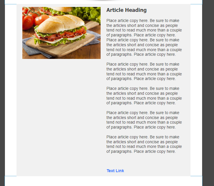
Generally speaking, Featured Articles are to include an image, a very short summary of a webpage or caption, and then a link to a larger article. If you add too much text, you start to end up with this kind of setup:
If you're wanting to have a longer description for your article setup, and adjusting the column border between the two doesn't achieve a more desirable visual, then here's a couple suggestions for how you can better format the setup.
First suggestion:
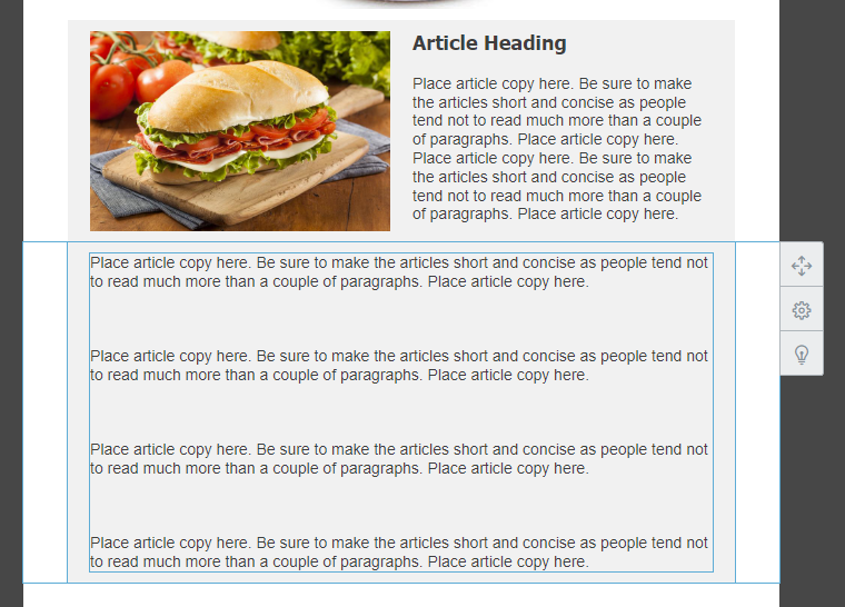
You could have just one or two paragraphs on the side. Then place a separate article block beneath, with the image removed so you still have that inner color difference. Then just add the rest of your text.
Second suggestion:
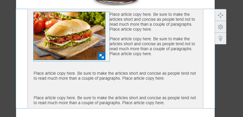
You could text-wrap your image into the body of text instead.
~~~~~~~~~~~~~~~~~~~~~~~~~~~~~~~~~~~
William A
Community & Social Media Support
- Mark as New
- Bookmark
- Subscribe
- Mute
- Subscribe to RSS Feed
- Permalink
- Report Inappropriate Content
Thanks for the suggestions. Let me see which works best. I don't have this situation every week, and often, the amount of text is not as large as the example you provide, but is enough to make it visually less appealing.
Thanks,
L


