- Mark as New
- Bookmark
- Subscribe
- Mute
- Subscribe to RSS Feed
- Permalink
- Report Inappropriate Content
Within my email, I created buttons with white text which link to additional information. Once email is sent. When the button is clicked the button text turns dark purple. The original color is only restored when you go out of the email and open again. Is there a place in CC where you can select the color of the font when the button is clicked? Or set the button so the font color doesn't change color when clicked? Please advise. Thank you
- Labels:
-
E-Mail Editor
- Mark as New
- Bookmark
- Subscribe
- Mute
- Subscribe to RSS Feed
- Permalink
- Report Inappropriate Content
Hello @JulieH425 ,
Is this occurring across all email programs and apps you check it in, or just one in particular?
The text of the button should be whatever you've set it as. It's possible the email program is deliberately forcing any linked text to be the standard blue and clicked-purple formats, since this is done by some as a default safety measure against sneaky suspicious emails/links.
If what I've described is your situation, you might check to see if there's any settings you can check in the particular email program to turn this functionality off. Otherwise, you may need to use a screencap of the button as it should be, and make it an image link instead.
~~~~~~~~~~~~~~~~~~~~~~~~~~~~~~~~~~~
William A
Community & Social Media Support
- Mark as New
- Bookmark
- Subscribe
- Mute
- Subscribe to RSS Feed
- Permalink
- Report Inappropriate Content
The button text changes color even when viewed in Preview format inside Constant Contact. The set color is white and displays white until clicked then turns dark purple.
- Mark as New
- Bookmark
- Subscribe
- Mute
- Subscribe to RSS Feed
- Permalink
- Report Inappropriate Content
Does this occur in other browsers you test in? Does it occur with newly added buttons?
~~~~~~~~~~~~~~~~~~~~~~~~~~~~~~~~~~~
William A
Community & Social Media Support
- Mark as New
- Bookmark
- Subscribe
- Mute
- Subscribe to RSS Feed
- Permalink
- Report Inappropriate Content
This should be a no-brainer, you'd think, for Constant Contact--we can select the color for links and yet have no control over the color of clicked links. It's especially a problem on buttons. If we can't choose the color ourselves, at least the color it goes to when clicked should not be so dark, since buttons tend to be a dark or bright color.
- Mark as New
- Bookmark
- Subscribe
- Mute
- Subscribe to RSS Feed
- Permalink
- Report Inappropriate Content
I was incorrect in stating that the buttons changed color when viewed and clicked in Preview mode inside CC. But, when emailing a test to ourselves - Windows 10 Pro - Outlook Email. The buttons do not maintain their curved corner radius appearance. When clicked the button text changes to purple and remains that way until you close out of the email. When you reopen the email the button text is white again until clicked. Please see the attached screen captures.
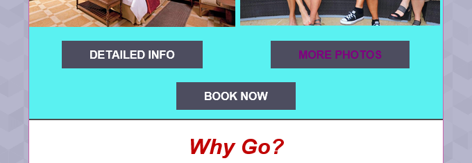
Button appearance inside Constant Contact.
Buttons when viewing email in Outlook. The MORE PHOTOS button has been clicked to demonstrate color change. Buttons do not display radius corners correctly.
- Mark as New
- Bookmark
- Subscribe
- Mute
- Subscribe to RSS Feed
- Permalink
- Report Inappropriate Content
Outlook will always force the buttons to be squared instead of rounded. It's something to do with how Word is reading the HTML coding in emails sent through us.
If Outlook keeps forcing the color change, I'd advise reaching out to Outlook's support to see if they'd have any further insight on the clicked-link color changes.
~~~~~~~~~~~~~~~~~~~~~~~~~~~~~~~~~~~
William A
Community & Social Media Support
- Mark as New
- Bookmark
- Subscribe
- Mute
- Subscribe to RSS Feed
- Permalink
- Report Inappropriate Content
This is not only an Outlook problem it happens with outlook, thunderbird, outlook browser access, yahoo browser access, mail.com--those are just the ones I was easily able to check.
However your comments do give some insight into the problem. What the developers need to do is add a style specification where the CC customer can select the color for a "visited link" the same way it can be specified for a website. This could be part of the style sheet or the editing toolbar. Without this, it seems that the color of the visited link will always revert to a default that's set by who knows who. Can we get this suggestion in the pipeline?
- Mark as New
- Bookmark
- Subscribe
- Mute
- Subscribe to RSS Feed
- Permalink
- Report Inappropriate Content
Given that Constant Contact is a tool that is to communicate via email - you should be able to set the visited link color inside the CC program and have it work properly in all email platforms. Same issue with button radius not working.


