Display Issues – Why does my email look different when received?
- Subscribe to RSS Feed
- Mark as New
- Mark as Read
- Bookmark
- Subscribe
- Printer Friendly Page
- Report Inappropriate Content
Display Issues – aka why does my email look good in X, but bad in Y?
A well-made email can do a lot for engagement. Like any “traditional” newspaper, advertisement, or invitation, an email’s composition and layout can decide whether your target audience actually wants to engage with your material, or simply opens and otherwise ignores. Crafting the best-looking email can take time, even with all the coding knowledge or tools available to streamline the process. So why is it that some emails will look like their idealized versions in the Preview in some programs, but have incorrect formatting or missing elements in other programs?
In this guide, we will address some of the common factors that can affect your email’s appearance upon delivery, as well as what you can do on your side to ensure your email is being presented as perfect as possible.
---
I. Why do email programs work so differently from each other?
There can be massive differences in the systems used to read and interpret HTML (or CSS) coding, which is the primary way to code emails. Different email programs can use wildly different systems to render and display the code being sent to them – such as HTML5 Doctype or even Microsoft Word. Different software can result in certain elements not being allowed, or simply not being compatible. What works in Gmail or Apple Mail may not work in Outlook or Office 365, or vice versa. Similarly, what works in an email app for iPhone may not in the same app for Android, or vice versa.
---
II. What can I do to make my email look as perfect as possible?
There are a number of steps you can take prior to sending the email, to ensure optimal display across multiple devices and email programs/apps. The first is to simply check a Preview of your email – to see how it will ideally look in both Desktop and Mobile formats. Mobile apps typically rearrange an email so it goes from a left-right/top-down setup to just top-down. An image block you set to the left of your text block will be above the text block in a mobile display. Similarly, mobile apps will try to display an image based on its metadata resolution - its true resolution - rather than what you sized it to be when editing the email.
Related articles:
Insert a Handwritten Signature into an Email
The next step you can take is to send a test of your email. This will allow you to send a version of your email to up to five email addresses at a time. Recipients can preview the email in their preferred email programs/apps. This allows you to see how specific email programs might render your email, especially if night mode or other personalized settings are turned on.
A final step to consider would be to utilize the Inbox Preview premium add-on, provided by Litmus. Inbox Preview allows you to see how an email will explicitly display on Apple’s iPhone and iPad, Google’s Android, Microsoft’s Outlook, and Google’s Gmail. You get up to five of these previews per month, so we recommend using it as the final check before scheduling the email.
Make sure to check the links for tips and tricks for optimizing mobile and desktop viewing of your emails!
---
III. My email looks perfect everywhere else, but the images are missing in a particular program. Why?
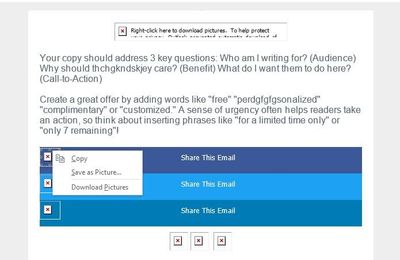
Email programs can be very restrictive with certain design elements of emails coming through. While most modern email programs’ spam filters are advanced and thorough enough to catch potential spam and phishing, there’s still the potential for something to slip through. Hence some email programs, such as Outlook, will still block images and other embedded elements from displaying in their programs until the recipient explicitly allows/downloads the elements to display. This can be a default setting, a personalized choice, or an absolute rule depending on the email program, the user, and the network or organization they’re under that’s providing the email program access.
Related article:
Images Not Displaying in an Email Client
An important step to take, if you’re using a VPN or similar security program, and especially if you’re on a very secure organization’s network, is to get our domains safelisted. It’s not just the open-tracking pixel or the tracking links that are affected by whether our domains are allowed, it’s also the images and files you add since those are hosted in the cloud that is My Library. Display issues can tie into overall deliverability concerns, which is why safelisting and authenticating (especially if you’re sending to an address on an organization’s internal email system) is pretty important.
Related article:
Help Overview: Understanding Email Authentication
---
IV. How concerned should I be about these display issues?
The truth of the matter is that for the vast majority of customers, they won’t have any concerns about differences between what Preview shows and what is actually rendered in a recipient’s program. However, it’s important to know your target audience as well. If your contacts are predominantly personal email addresses, then they’re likely being opened in Apple Mail or Gmail, which make up the vast majority of email program usage. Apple Mail and Gmail tend to render emails sent through us, including custom-coded templates, faithful to the Preview’s “idealized” appearance.
If a significant portion of your contacts come from business and/or other organizations’ emails, there’s a good chance they’re using Outlook, Office 365, or a similar program as their preferred email client. The extra security elements, such as not displaying images right away or outright blocking emails with elements from domains not safelisted, will be something to pay attention to. The fact that Outlook renders using Word may mean that some email elements will simply not work no matter what.
---
Please make sure to take some time to look through the linked articles throughout this article to see if there’s been any updates since the last time you’ve visited. As always, if you have any questions, we’re happy to assist in the Get Help section of the Community!
Remember, you’ve got this! You’ve got us!
You must be a registered user to add a comment. If you've already registered, sign in. Otherwise, register and sign in.


