- Mark as New
- Bookmark
- Subscribe
- Mute
- Subscribe to RSS Feed
- Permalink
- Report Inappropriate Content
Good afternoon I am a 20 year customer. I have used event management for the 20 years. You are switching over to a new platform for event management. Old events can not be copied and pasted. I get it. I am fine with it. Yet I can not get the new platform to put 3 pictures horizontally across a landing page like the old one did. I called support. 30 minutes in I disconnected. I was constantly being put on hold so the individual could talk to tiar 2. Tier 2 got 2 pic horizontally (which I had already done and told the individual such prior) and they were at the bottom of the page, not in the middle. This was done on the old platform, what is the issue? Who brings out a replacement product that has less features? I asked, why dont you put me through to tier 2 so I can get this resolved? I was told - I cant do that, its protocol. This is extremely poor. Something as simple as putting 3 pics side by side is done every day by CMS systems and should not be a 30 minute phone call, on hold 5 times so the person from Constant Contact can talk to tier 2. with me finally disconnecting What kind of support is this? Bottom line. How do I put 3 pics horizontally on a landing page??
- Labels:
-
Events Marketing
-
Landing Pages
Hello @DouglasB865 ,
Within the event block type, whether in emails or landing pages, images aren't currently able to be lined up beside each other. Images would either need to be added, stacked vertically within the block, or they'd need to be added outside of the event block.
When adding outside of the event block, you can either drag over individual image blocks, or you can drag over one of the three-column layout blocks.
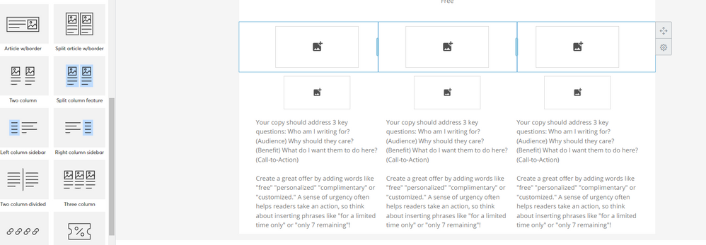
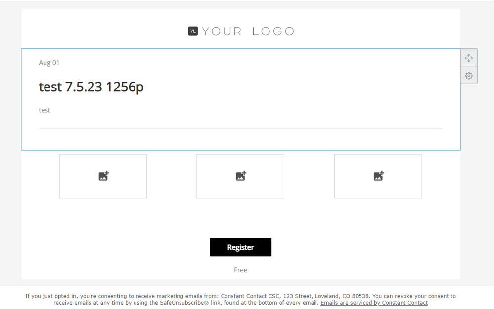
Another option would be to add two of the same event block, remove some of the default sections of each, and then insert your images in the middle, like so:
While it is a roundabout way, it's the best available method within the newer event tool at this time to get a 3-image / 3-column lineup between the autofilled event blocks.
Beyond all this, the only other workaround I'd suggest is to not use the event block at all, and to instead build your event landing page without one. You'd just use the regular text, image, button, and/or layout blocks to create it all. Events have their own unique URLs once activated, and this could be linked to effectively any button on any type of landing page, even ones made outside of the event.
- Mark as New
- Bookmark
- Subscribe
- Mute
- Subscribe to RSS Feed
- Permalink
- Report Inappropriate Content
Hello @DouglasB865 ,
Within the event block type, whether in emails or landing pages, images aren't currently able to be lined up beside each other. Images would either need to be added, stacked vertically within the block, or they'd need to be added outside of the event block.
When adding outside of the event block, you can either drag over individual image blocks, or you can drag over one of the three-column layout blocks.
Another option would be to add two of the same event block, remove some of the default sections of each, and then insert your images in the middle, like so:
While it is a roundabout way, it's the best available method within the newer event tool at this time to get a 3-image / 3-column lineup between the autofilled event blocks.
Beyond all this, the only other workaround I'd suggest is to not use the event block at all, and to instead build your event landing page without one. You'd just use the regular text, image, button, and/or layout blocks to create it all. Events have their own unique URLs once activated, and this could be linked to effectively any button on any type of landing page, even ones made outside of the event.
~~~~~~~~~~~~~~~~~~~~~~~~~~~~~~~~~~~
William A
Community & Social Media Support
- Mark as New
- Bookmark
- Subscribe
- Mute
- Subscribe to RSS Feed
- Permalink
- Report Inappropriate Content
Thanks for the feedback. But it is not all correct.
You wrote:
When adding outside of the event block, you can either drag over individual image blocks,
When you do this it puts the first one in the middle, and the next below it.
You wrote:
or you can drag over one of the three-column layout blocks.
The editor always puts the 3 column layout at the very bottom. You can not drag it where you want it.
I understand that what I am looking for is not available. Who does this? The old system for 20 years did it. You call it Beta in your response and I have seen that posted on here by others. So, a product that works, is being replaced by a Beta product that has less features. Does that makes sense?
I would expect a replacement platform be equal to and probably better than the one it is replacing. Not a Beta. Beta is still not complete. The old one expires December 31, and it is October and the customer still does not have a finished editor platform.
I want you to know, I do not have an issue having to redo my events. I get it. Your upgrading to a new platform and I cant copy the old events. That is fine. But I would expect the replacement platform to be equal to if not better than than one it is replacing. Not have less features and still be in Beta.
- Mark as New
- Bookmark
- Subscribe
- Mute
- Subscribe to RSS Feed
- Permalink
- Report Inappropriate Content
@DouglasB865 wrote:
Thanks for the feedback. But it is not all correct.
You wrote:
When adding outside of the event block, you can either drag over individual image blocks,
When you do this it puts the first one in the middle, and the next below it.
You wrote:
or you can drag over one of the three-column layout blocks.
The editor always puts the 3 column layout at the very bottom. You can not drag it where you want it.
Yes, as I explained, it's still in the middle of the event block, which is its own standalone function. You'd need to be editing the event block to be able to additional image blocks to it, which as I admitted can only be done vertically at this time. If you're trying to drag over image blocks without actively editing the event block portion, then yes they'd "go to the bottom" or top since those are the only spaces outside of the event block when you're first creating an event landing page.
~~~~~~~~~~~~~~~~~~~~~~~~~~~~~~~~~~~
William A
Community & Social Media Support
- Mark as New
- Bookmark
- Subscribe
- Mute
- Subscribe to RSS Feed
- Permalink
- Report Inappropriate Content
If you have any further feedback on the events 2.0 beta, rather than troubleshooting and workaround questions, I'd advise checking out our Feedback boards. You can either make a new thread if it's a new topic / suggestion, or respond to one of the existing events beta feedback threads. Any feedback thread regarding events so far will be marked with Events 2.0 in its name.
~~~~~~~~~~~~~~~~~~~~~~~~~~~~~~~~~~~
William A
Community & Social Media Support


